Recently I visited one office in New York, Project Projects, which is involved in processes of designing and guiding our experience and knowledge about landscape, architecture, the city and alike, thereby contributing to shape our (mental) image of real places and environments, but who as well create situations to question and enrich our understanding of the (urban) environment we live in.
Project Projects is a design studio focusing on print, identity, exhibition, and interactive work with clients in art and architecture. The studio was founded in 2004 by Prem Krishnamurthy and Adam Michaels; Rob Giampetro joined as principal in 2010. Project Projects work for numerous institutions and offices, including Bernard Tschumi Architects, Field Operations, Guggenheim Museum, MOMA, Princeton Architectural Press, or, Steven Holl Architects, amongst other. Next to these client-specific projects, the studio as well initiates and produces independent curatorial and publishing projects.
The conversation with Prem Krishnamurthy took place during New York City's pre-Christmas buzz, which left us just enough time to briefly touch some aspects of the work done at the studio.
Asked about aspects of craftsmanship in the studio, Krishnamurthy mentioned that handwork is very important and is something often talked about within the studio. He mentioned that it is important for Project projects that their work is coherent and exact and that a certain transparency exists during the design process which is as well reflected in the finished product. Within the diverse range of work done by Project Projects, the concept is, as intellectual backbone, equally important as handwork and a love for details. What finally proves the product's quality is it's congruent representation in the specific context.

Regarding the very diverse output of Project Projects, ranging from the design of single books to whole identities for museums or parks, there is often a very unique aesthetic signature, reflecting that for Project Projects it is more important that their design supports the specific content of the product, and does not represent a certain style stemming from the office itself. In that sense, content is used to derive a unique visual appearance and not a (pre-marketed) visual appearance used to sell the content.
It is interesting that, despite the (as well graphically) very diverse output of the studio, the design of the Project Projects webpage is very calm and reduced. What decides about the specific form of a certain product coming from the Project Projects studio?
Within the studio there exists a good degree of creative freedom with different approaches and work routines informing each other. Asked about his personal work process, and the importance of head and/or hand within this process, Prem Krishnamurthy told me that his work is characterized by a first deep intellectual engagement with the specific task, then followed by the production of initial sketches whose number is dependent on the project and which are used to outline different scenarios. In this process the mental (pre)work is very fruitful and its importance often appearing later, once the hand started to sketch.
For Prem Krishnamurthy it is important that all the initial ideas are well tested and live up to the studio's quality standards. Then, in the process of reflection with the client, there should be only the relevant few left, the scenarios which you are convinced about, so a satisfying decision can be reached together with the client.
This process diverges a little for the task of producing 'identities', whole representations for clients such as museums or publishers for example. In finding a new identity it can be very fruitful to openly show various ideas and even mix different ideas to create an identity the client is well represented with.
Currently Project Projects is as well involved in the process of transforming one of the world's vastest landfills, the Fresh Kills landfill in Staten Island, into the largest public park developed in New York City since more than 100 years. Together with the landscape architects Field Operations and New York City's Department of Parks & Recreation, Project Projects is designing the identity for the new park and a signage system which uses existing structures and indicates the long-term (30 years) transformation of the site.
The Freshkills-slogan "re imagine" reminded me that we can differentiate aspects and meanings of landscapes according to the levels of the real, the imaginary and the symbolic. I supposed that Project Projects in this case was aiming to create a different understanding for the place in the mental image of Staten Island and NYC residents. Prem Krishnamurthy replied that Fresh Kills is at this point both, a real and an imaginary place as nothing has been constructed yet, so at this point, they are working with the imaginary representation of the site.
In the case of Freshkills park, the aim of Project Projects is to use graphics and visual design to nourish people's fantasy to develop a prospect of what can happen at the Fresh Kills landfill if turned into a public park.
The act of placemaking and imaginary re-design of Fresh Kills started by a simple, yet clever intervention by the designers. The designers renamed the 'Fresh Kills landfill' into 'Freshkills Park' to allow people to create new associations to the place.
As Krishnamurthy states "it is about the creation of possibilities" at a site already monumental because of the sheer vastness of space and the distinct existing structures. The design for the park's identity and signage therefore followed the approach of 're-purposing' existing elements on the site. Diggers will be used to mount signs and an initial design idea proposed to use corten steel on the site for the signage.
One example for a landscape-related publication designed by Project Projects is Alan Berger's 'Drosscape - Wasting Land in Urban America', published by Princeton Architectural Press. Project Projects worked in this case with the existing graphics and a manuscript and successfully adapted initial design ideas to support readability and usability of the publication. Thereby the (book)designers helped the readers to understand certain landscape phenomena and are an important support for scholars to successfully get their word out in an aesthetic and graphically clear form.
Project projects is as well active as independent publisher and editor. One good example for this work is the book 'Above the Pavement - The Farm!'. The book was published within the Project Projects spin-off 'Inventory Books' which is 'a platform for the synthesis of textual and visual research on transformations in urban spaces and culture. The series is edited by Adam Michaels, designed at Project Projects, published by Princeton Architectural Press' and presents rigorous content in an accessible format for a diverse public.' [source]

'Above the Pavement - The Farm' presents text, drawings and images to document the processes which led to the final form of the 'Public Farm PF1', designed and organized by WORKac and built by over 150 volunteers at PS1 in 2008. The book presents oral histories of all people involved in the process and was an interesting alternative approach (to glossy architecture publications) for Project Projects to present architectural design by making 'tactile architectural processes' available to the readers. This book is especially interesting for architects and students of architecture or landscape architecture as they can learn about 'real' processes of architectural (and landscape) construction from how the book is 'demystifying a fast-paced, complex collaborative process.' [source]

 |
| Project Projects principals depicted for the series 'Project Projects Postcards', (2005). [image courtesy of Project Projects] |
 |
| Fraction of the bookshelf in the studio of Project Projects. |
Asked about aspects of craftsmanship in the studio, Krishnamurthy mentioned that handwork is very important and is something often talked about within the studio. He mentioned that it is important for Project projects that their work is coherent and exact and that a certain transparency exists during the design process which is as well reflected in the finished product. Within the diverse range of work done by Project Projects, the concept is, as intellectual backbone, equally important as handwork and a love for details. What finally proves the product's quality is it's congruent representation in the specific context.

Regarding the very diverse output of Project Projects, ranging from the design of single books to whole identities for museums or parks, there is often a very unique aesthetic signature, reflecting that for Project Projects it is more important that their design supports the specific content of the product, and does not represent a certain style stemming from the office itself. In that sense, content is used to derive a unique visual appearance and not a (pre-marketed) visual appearance used to sell the content.
 |
| Website design (2010) for North Grant Park, Chicago by landscape architects MVVA. [image courtesy of Project Projects] |
Within the studio there exists a good degree of creative freedom with different approaches and work routines informing each other. Asked about his personal work process, and the importance of head and/or hand within this process, Prem Krishnamurthy told me that his work is characterized by a first deep intellectual engagement with the specific task, then followed by the production of initial sketches whose number is dependent on the project and which are used to outline different scenarios. In this process the mental (pre)work is very fruitful and its importance often appearing later, once the hand started to sketch.
 |
| Exhibition design for 'Fast Trash', 2010. [image courtesy of Project Projects] |
For Prem Krishnamurthy it is important that all the initial ideas are well tested and live up to the studio's quality standards. Then, in the process of reflection with the client, there should be only the relevant few left, the scenarios which you are convinced about, so a satisfying decision can be reached together with the client.
This process diverges a little for the task of producing 'identities', whole representations for clients such as museums or publishers for example. In finding a new identity it can be very fruitful to openly show various ideas and even mix different ideas to create an identity the client is well represented with.
 |
| Project Projects designed identity, signage and environmental graphics for Hudson River Park Pier 62, (2010). [image courtesy of Project Projects] |
Currently Project Projects is as well involved in the process of transforming one of the world's vastest landfills, the Fresh Kills landfill in Staten Island, into the largest public park developed in New York City since more than 100 years. Together with the landscape architects Field Operations and New York City's Department of Parks & Recreation, Project Projects is designing the identity for the new park and a signage system which uses existing structures and indicates the long-term (30 years) transformation of the site.
 |
| Visually staging the appearance of Freshkills park. [image courtesy of Project Projects] |
In the case of Freshkills park, the aim of Project Projects is to use graphics and visual design to nourish people's fantasy to develop a prospect of what can happen at the Fresh Kills landfill if turned into a public park.
 |
| Re-use of existing structures in creating freshkills park. [image courtesy of project projects] |
The act of placemaking and imaginary re-design of Fresh Kills started by a simple, yet clever intervention by the designers. The designers renamed the 'Fresh Kills landfill' into 'Freshkills Park' to allow people to create new associations to the place.
As Krishnamurthy states "it is about the creation of possibilities" at a site already monumental because of the sheer vastness of space and the distinct existing structures. The design for the park's identity and signage therefore followed the approach of 're-purposing' existing elements on the site. Diggers will be used to mount signs and an initial design idea proposed to use corten steel on the site for the signage.
 |
| Initial design for park signages made from solid steel found on site at freshkills park. [image courtesy of project projects] |
One example for a landscape-related publication designed by Project Projects is Alan Berger's 'Drosscape - Wasting Land in Urban America', published by Princeton Architectural Press. Project Projects worked in this case with the existing graphics and a manuscript and successfully adapted initial design ideas to support readability and usability of the publication. Thereby the (book)designers helped the readers to understand certain landscape phenomena and are an important support for scholars to successfully get their word out in an aesthetic and graphically clear form.
 |
| Proof for "Drosscape - Wasting Land in Urban America' by Alan Berger, book design by Project Projects, (2006). |

'Above the Pavement - The Farm' presents text, drawings and images to document the processes which led to the final form of the 'Public Farm PF1', designed and organized by WORKac and built by over 150 volunteers at PS1 in 2008. The book presents oral histories of all people involved in the process and was an interesting alternative approach (to glossy architecture publications) for Project Projects to present architectural design by making 'tactile architectural processes' available to the readers. This book is especially interesting for architects and students of architecture or landscape architecture as they can learn about 'real' processes of architectural (and landscape) construction from how the book is 'demystifying a fast-paced, complex collaborative process.' [source]
 |
| 'Above the Pavement - The Farm' readable as 'maybe the biggest book of the summer' at Union Square market, 2010. [image courtesy of Inventory Books] |
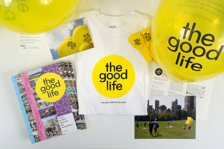 |
| Collateral materials for 'The Good Life'. [image courtesy of Project Projects] |
In 2006 Project project was designing identity, printed materials, website and motion graphics for the exhibition 'The Good Life: Public Spaces for Recreation'. Talking about the work on this project, Prem Krishnamurthy underlined the importance that the visual design for exhibitions unifies the reading and seeing to support the viewer's engagement with the subject. In the case of exhibition design, the studio seeks to create 'immersive exhibitions' which contain various depths of information so that people can freely engage with the exhibition on various levels and can let themselves be drawn closer and closer to the subject.
 |
| Exhibition 'The Good Life' at pier 40, Manhattan west. [image courtesy of Project Projects] |
For the 2005 artist group exhibition 'The Plain of Heaven' Project Projects was responsible for designing exhibition graphics, catalog, website and collaterial materials. The exhibition took place in a building destined to be demolished at the southern terminus of the High Line. The exhibition graphics were spray-painted in stencils and the catalog contained some hidden narrative on the inside of the french-folded pages.
 |
| Location of exhibition 'The Plain of Heaven' in 2005, nowadays busy as High Line Park southern access. [image courtesy of Project projects] |
 |
| Exhibition catalog of 'The Plain of Heaven'. [image courtesy of Project Projects] |
Concluding the visit to Project Projects, Krishnamurthy stated that the best work they are doing is possible in situations where their own fields of interest (he mentioned architecture, landscape architecture, art and urban planning, amongst others) are represented in the content of the projects and allow the studio's team to personally engage with the subject matter and be inspired by it. I wish the team of Project Projects that they can continue to enrich and support our gathering of (visual) knowledge and continue in an inspired way to create extraordinary situations in public, virtual and printed space which in turn allow us to become inspired.


